


What are value, temperature and chroma in the colour analysis?
You found out about the wonderful world of colour analysis, you read about seasons, different systems – 4 seasons, 12 seasons, 16 seasons and you get super confused!
It’s okay, relax, take a deep breath! We’ve all been there. 😅
Let me explain to you what this means.
Here at Armochromeow, I use the system created by Ferial Youakim and then perfectioned by Giusy De Gori, the one with 16 seasons. I will write more about each of them in some separate posts, but for now, let’s focus on the basics so you can understand what we need to know in order to identify your season.
There are a few things that we need to consider once we want to analyse your season:
1. Temperature
2. Value
3. Chroma
4. Contrast
5. Depth
6. Main Characteristic
1. Temperature
Temperature refers to the warmth or coolness of a colour, and in our case, of a season. Summers and winters are cold (to neutral-cold) seasons, while springs and autumns are warm (to neutral-warm) seasons.
2. Value
It’s the lightness or darkness of a colour, tint, tone or shade. On a value scale, black is at one extreme, white at the other.
For instance, winters and autumns tend to have dark value while summers and springs tend to have light value.
3. Chroma
It’s the purity of a colour or its freedom from white or grey. It’s the intensity of a distinctive hue, the saturation of a colour. Thus, a colour with high chroma has very little grey in it whereas a colour with low chroma has more grey in it.
For example, bright seasons (bright spring or bright winter) have very high chroma, which means that they would be enhanced by vivid colours and/or fluorescent tones; while a soft light summer, for instance, has very low chroma – so it would be enhanced by light pastels, soft colours and toned hues.
4. Contrast
It is one of the principles of colour balance which refers to the striking difference between two elements, in this case, colours. For example, there is a strong contrast when you place vivid red next to black. While there is low contrast when you place pastel blue next to pastel pink. Deep winter is the season with the highest contrasts, while light summer is the one with the lowest ones.
5. Depth
Depth is strictly connected to contrast and is the intensity of colours in a specific season; it’s an indicator of what level of darkness in colour, a specific individual can handle in order to be balanced. For instance, seasons that are deep by nature (deep winter, deep autumn, soft deep summer, smoky deep winter and soft deep autumn) are able to handle darker colours than their lighter counterparts.
6. Main Characteristic
It’s the most important aspect of that season, it’s what characterises it the most, the first thing that comes to mind when you look at that person. Are you a bright winter? Then your main characteristics are brightness and high chroma. Are you a warm autumn? Then your main characteristic will be the warm temperature.
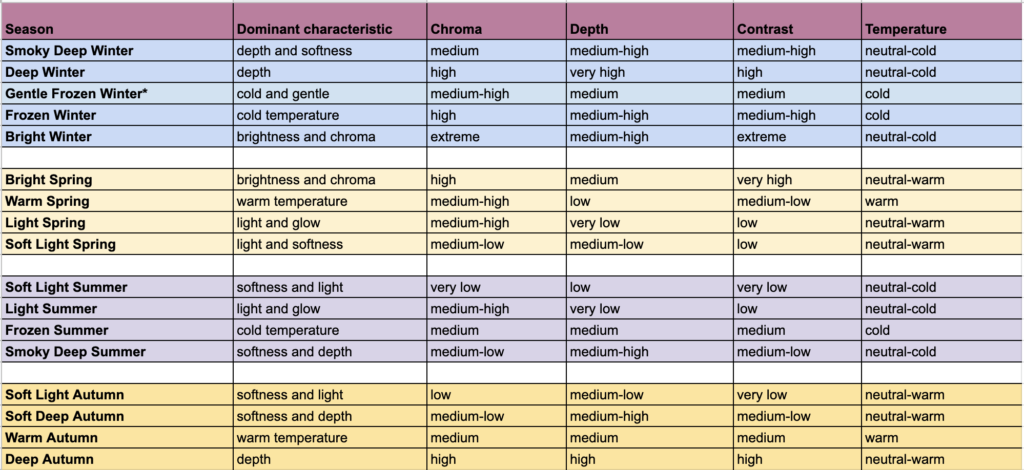
Here you can find a table that I created that summarises all the seasons and their characteristic:
Deandre Pelini
I greatly appreciate your talent to convey complex concepts in a digestible manner. Keep up the good work!
admin
Thank you!